ADOT served well by four logos over 45 years
ADOT served well by four logos over 45 years
ADOT has been represented by four very distinct logos over the last 45 years. Each one has helped the agency to create an identity and build public awareness, which is exactly what a well-designed logo is supposed to do.
1974-1995
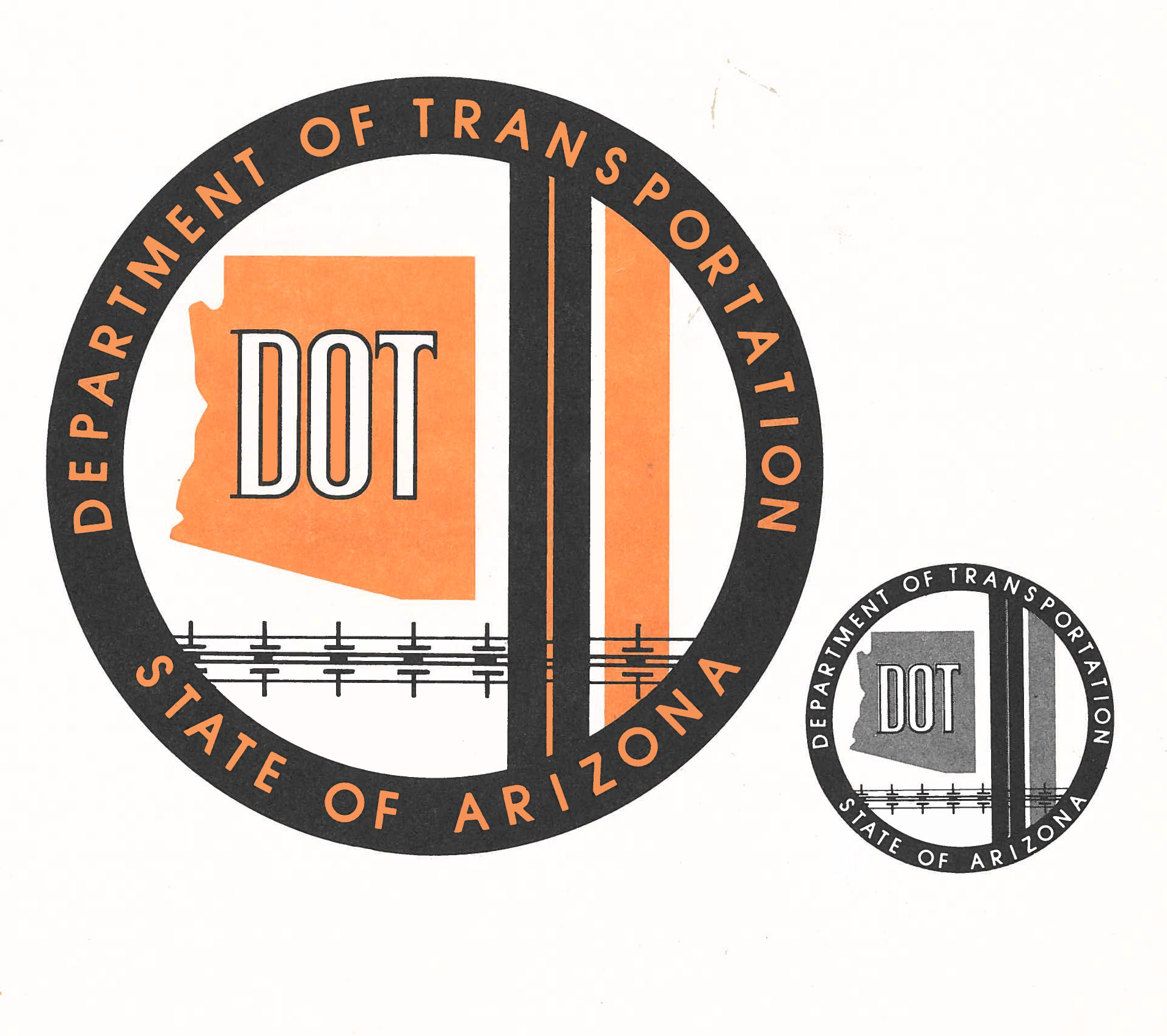
This logo was designed by an ADOT graphic artist named Lillian Becker back in 1974 when the Arizona Highway Department officially became ADOT. According to a 1995 issue of Newsbeat, ADOT’s employee newsletter of the day, elements of the logo signified different parts of the new agency:
“One of the vertical lines represented a highway and the other a runway. The bottom horizontal line represented mass transportation, which was a new responsibility for ADOT during the 1970s.”
1995-1999
While it stayed around for only four years, this logo was one that employees were excited about in 1995, according to Newsbeat. The newsletter quoted an employee representative saying that the idea for the new logo was to take on a “modern corporate look that was less stuffy.” According to Newsbeat, the Executive Quality Council worked with ADOT graphic artists, who developed about 60 ideas for a potential new logo. A “special logo team” picked six logos and sent out ballots with the choices. Newsbeat reported that 53% of ADOT employees responded, and the winning logo received 1,027 votes, or about 43% of the responses.
1999-2012
When ADOT celebrated its 25th birthday 20 years ago, this logo was adopted to take the agency into the new millennium.
According to a 1999 issue of Mileposts, the employee newsletter of the day, ADOT Director Mary Peters challenged a nine-member team to develop a new logo that would “would work well with an aggressive marketing plan and improve the image of the agency both in the public sector and within the agency.” ADOT graphic designer Ron Loar was quoted by Mileposts describing the design:
“We were after a contemporary design … The new logo breaks away from a traditional government look and achieves a corporate look in keeping with current graphic design trends.”
The logo’s colors — plum and teal — were chosen, according to Mileposts, for their overall appeal and because they are representative of the Southwest.
2012-present
In 2012, it was determined that the agency’s logo was outdated and didn’t adequately represent ADOT as a progressive multimodal agency. This logo, which is still in use today, is a streamlined interpretation of the former logo that focuses on the ADOT text element. Today’s logo reinforces ADOT name recognition while removing the former logo’s immediate association with only roads.